Last Week, 8 out of the 10 Hyundai A-league clubs new kit were released. Still no word on Brisbane or the Gold Coast’s kits – but here’s a lot at those that were revealed:
Adelaide: Adelaide’s home kit is fairly similar to previous years, although there does appear to be some sort of pinstripe pattern – hard to tell from the low res images though. Looks good though. The away kit is a little retro, but is a nice change.
Central Coast:
 No surprise here, we have already seen this kit. They really should fix the back of the home kit – the player name looks silly going over the stripes. They should really just make the top half of the back of the kit plain yellow, with a blue name and number. (similar to Perth’s kit – see below)
Melbourne:
 Melbourne goes with a fairly standard strip, the V looks a little thinner than it used to, which is good. The little v’s running down the side are somewhat odd, but shouldn’t look too bad on the final kit. The away kit is white, rather than silver – looks good though.
Newcastle:
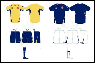 Newcastle will not use their Champions League kit in next year’s A-league. Their kit will, in fact, be very similar to their kit from last year. They’ve gone with a blue away kit, which looks good although I would have liked to have seen a blue/red away kit.
North Queensland:
 North Queensland kit was leaked last week. This design looks quite bright, but I think the actual kit will look better than this looks on paper.
Perth:

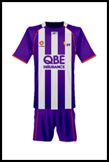 Perth have gone the vertical stripes for next season, while I would have preferred hoops (just because we already have a couple of other teams in vertical stripes), this kit looks great. Again, I expect the actual kit to look better than the kit does on paper, because this design is quite bright. I think this is more accurate to what it will actually look like:
Sydney FC:
 Sydney’s kit is fairly standard, but it certainly looks good. You can’t have everyone wearing an ‘interesting’ kit.
Wellington:
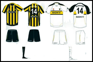 Wellington’s striped kit looks excellent. Their away kit is very nice as well. They have done the same thing as Central Coast with their player names going over their stripes, which is the only problem I have with this kit.
Gold Coast, Brisbane:
These are the only two clubs yet to have their kits released, the delay for Brisbane might be related to their name-change from Queensland, while Gold Coast evidently are still working on theirs.
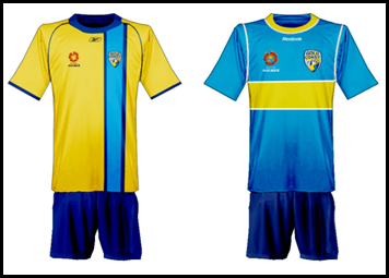
Here’s a couple of mock-ups I’ve done, I have a feeling that Brisbane will go with the maroon, while I think the Gold Coast might go with a predominantly yellow kit – although I prefer the teal.

Clashes:
One interesting thing to consider about the new kits is potential clashes. I imagine that most sides will wear their home shirt as much as possible, with their away kit ready as an alternative when required. Consider some examples though – what happens when:
Wellington hosts Central Coast?
Central Coast plays Newcastle?
Interestingly the only solution to these clashes might force the home team to wear their away strip. This is why, in Europe, a lot of sides (especially those with stripes) have to have 3 kits, to ensure that they can always provide an alternative strip to the home team. I wonder what the solution will be for the A-league?
Summary:
It’s great to see A-league clubs without the standard template kits this season. I also look forward to seeing an away team that isn’t wearing white.
These kits will likely be unveiled officially on Monday, when the A-league draw is released.
Matt


5 comments:
Matt will u post brisbanes and gold coast's kits when they r released?
Absolutely - hopefully we might see them tomorrow.
I just received my Sydney FC shirt from the club mail order yesterday and it is is sensational - the photos, images etc don't do justice to it. It has a 'traditional' look, but with all the sponsors and league logos on, truly looks great. I am sure this will be the case for all clubs as Reebok seems to have got there act together with the richest, most varied shirt design offerings since the start of the A-League!
I got my Adelaide United shirt the other day - and would certainly agree that they look better in real life than in pictures, even the weird logos (with the white outlines) look pretty good.
US Air Force orders 2200 Sony PS3s... Extending supercomputing Linux cluster
Post a Comment